How To Use
Setup your config
If you want to create a config quickly and easily, without having to worry about manual changes, use our builder. The builder is a web-based designing app and it's included in the package. It enables users to create an imteractive image in a short period. This saves you so much in terms of time and resources.
Create a simple HTML file
1. Load jQuery.js and jquery.imagelinks.min.js in the head section for your html document
<script type="text/javascript" src="js/jquery.js"></script>
<script type="text/javascript" src="js/jquery.imagelinks.min.js"></script>
2. Set up your image
<img src="assets/images/myimage.jpg" alt="My Image" id="myimagelinks">
4. Finally just call the plugin on your image
4.1 Simple example (without links)
$(document).ready(function() {

	$("#myimagelinks").imagelinks();

});
4.2 Advanced example.
$(document).ready(function() {
$("#myimagelinks").imagelinks({
theme: "imgl-default", // CSS styles for controls, change it to match your own theme
popover: true, // enable or disable the build-in popover system
popoverTemplate: "<div class='imgl-popover'><div class='imgl-close'></div><div class='imgl-arrow'></div><div class='imgl-content'></div></div>", // base HTML to use when creating the popover
popoverPlacement: "top", // set the position of the popover (top, bottom, left, right, top-right, top-left, bottom-right, bottom-left)
popoverShowTrigger: "hover", // specify how popover is triggered (click, hover)
popoverHideTrigger: "leave", // specify how popover is hidden (click, leave, bodyclick, manual)
popoverShowClass: null, // specify the css3 animation class for the popover show
popoverHideClass: null, // specify the css3 animation class for the popover hide
hotSpotBelowPopover: true, // specify the z-order of the hotSpot against the popover
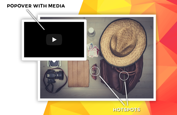
hotSpots: [], // specify an array of hot spots that can be links to news, posters, albums and other media content etc
// the definition of a hotSpot
// x: 0 // specify the x position of the hotspot’s location in % [0;1]
// y: 0 // specify the y position of the hotspot’s location in % [0;1]
// className: null // specify additional css classes
// content: null // if set, the value is displayed as the hotspot's content
// popoverHtml: true // specify the type of the popover content
// popoverWidth: null // specify the width in px of the popover
// popoverContent: null // if set, the value is displayed as the popover's content, it can be text or HTML content, or a method - function myfunc()
// popoverPlacement: "top" // set the position of the popover (top, bottom, left, right, top-right, top-left, bottom-right, bottom-left)
// userData: null // specify the user data that is associated with the hotspot, useful when the popoverContent is a method
hotSpotSetup: false, // set or disable manual setup of hotspots in the current image
mobile: false, // enable or disable the animation in the mobile browsers
});
});